
🎮 Which Chart Do We Pick?
Every message has a chart that fits it
📖 About this game
A game about charts, from the Spreadsheets unit, with the book’s own sentence as its rule: the choice of chart depends on the kind of data presented and the message that must be carried. All three come from the lesson itself: the column chart uses vertical bars to show comparisons between categories and the height of each bar matches its value, the pie chart shows data as slices of a circle with every slice in proportion to the amount it stands for so it is for parts of a whole, and the line chart shows data points joined by straight segments to show trends as time passes. Why the question is about the message and not the name: a name question is vocabulary, a message question is the lesson. The three drawings are built in code rather than pictures, so zero files and zero requests. Three cases per kind. No sign-up.
🕹️ How to play
- Read the message wanted and look at the data chips.
- Ask: comparing categories? Parts of a whole? Or change over time?
- Tap the chart that fits, out of the three.
- Every message you get first try counts for you.
🆕 Latest games in this section
🧒 Kids corner — more activities

🏆 Learn & compete — leaderboard games
Educational games from the main ScorePoint catalogue: they include leaderboards and ads.
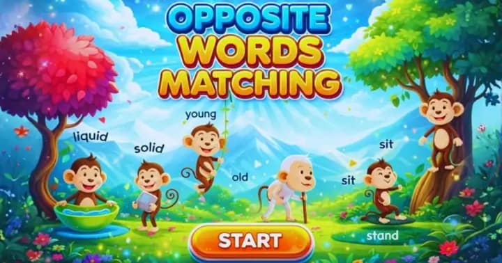 Opposite Words
Match each word with its opposite across 80 images and 15 levels.
Opposite Words
Match each word with its opposite across 80 images and 15 levels.
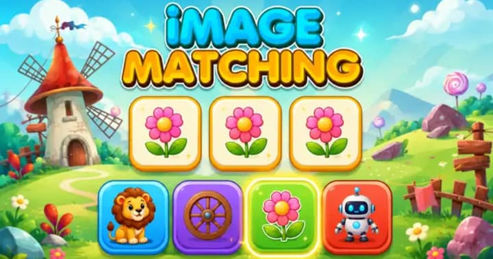 Image Matching
Drag the right image to complete the pattern across 45 levels.
Image Matching
Drag the right image to complete the pattern across 45 levels.
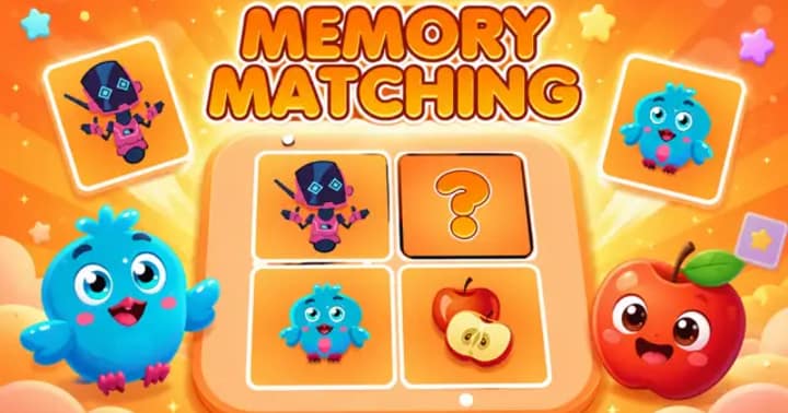 Memory Matching
Flip the cards and match the pairs before time runs out.
Memory Matching
Flip the cards and match the pairs before time runs out.
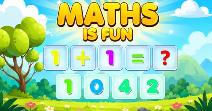 Maths is Fun
Pick the right number to solve addition and multiplication puzzles.
Maths is Fun
Pick the right number to solve addition and multiplication puzzles.